
Make it look right
A first conversion is one button. Everything after it is you deciding what the print should look like. Filafy has more say to give you than most people find on their own.
The 25 styles
A style is not a filter. Each one is a print program that outputs flat, printable regions in your exact filament colors, sized so its detail survives your nozzle. Every sample below is genuine pipeline output.
Click any tile for what that style does. Most styles carry one or two sliders, and every one of them is labeled with what its two ends do, right above the preview.
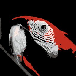 Color SplashThe classic color splash photo effect: everything goes black and white except ONE color you pick on the wheel. That color snaps to the closest colored filament you own. Accent range sets how much of the image keeps its color; Contrast shapes the grays.
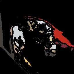 ComicInk outlines over flat color, the way a comic panel is drawn. Line weight is sized for your nozzle so the ink actually prints.
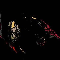 ContourYour image as a topographic relief map. Brightness becomes elevation bands in your filaments, with contour lines tracing each level.
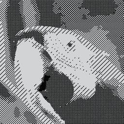 CrosshatchEngraved line shading, built so a single color printer can do it with one filament swap. Line spacing sets how close the hatching sits; Shading bands sets how many levels of it the image is broken into.
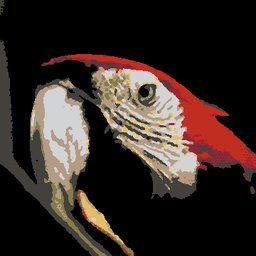 HalftonePop art shading dots. Dot size is tied to your nozzle, so the pattern stays printable rather than turning to mush.
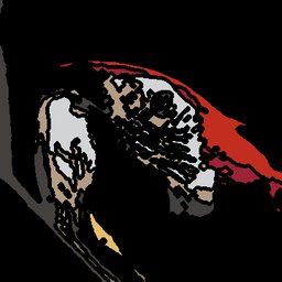 Line ArtOutlines inked over your colors. Detail decides how much of the image earns a line; the ink is whichever of your filaments is darkest.
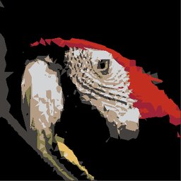 Low-polyThe picture rebuilt out of triangulated facets, each one a single flat filament color.
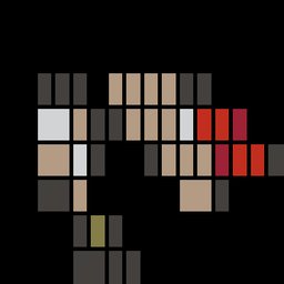 MondrianThe image carved into rectangles with a bold dark grid, De Stijl style.
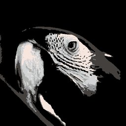 MonochromeStrictly your black, white and gray filaments, so the image becomes a luminance ladder. You need at least two owned neutrals. Contrast steepens the tones; Levels posterizes the ladder, up to as many grays as you own.
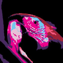 Neon DreamsA cyberpunk color grade: shadows pushed cool, highlights pushed electric, all still inside the filaments you own.
 NormalNo styling at all: your photo mapped straight to your filament colors, as faithful as the palette allows. The Simplify slider trades detail for printability, so higher means a simpler print with fewer tiny features and less risk of print errors. Leave it at Raw for maximum detail.
 PixelA mosaic grid, every cell one flat filament color. The slider sets how coarse the grid is.
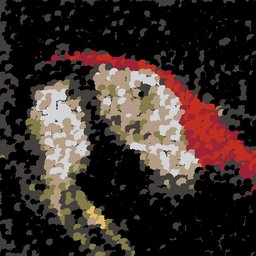 PointillistThe whole picture built from broken color dots, Seurat style.
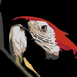 PosterizedCrisp flat regions with hard edges between them, which is the most naturally printable look there is.
 Retro DitherChunky 8 bit shading, mixing two filaments in a pattern to fake a third color your eye reads at a distance.
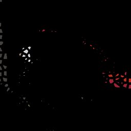 Stained GlassColor panels separated by dark lead lines, so every region prints as its own solid piece.
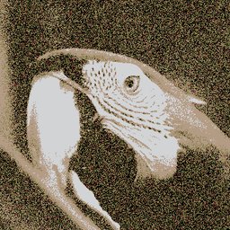 StencilA hard edged poster with spray painted stencil edges. Tones scales the ladder up to your Max colors.
 StickerA die cut halo and keyline around the subject, the way a vinyl sticker is cut.
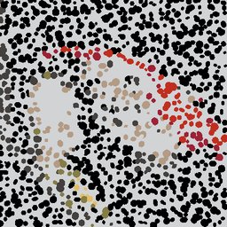 TerrazzoSpeckled color chips scattered through the image, like polished terrazzo flooring.
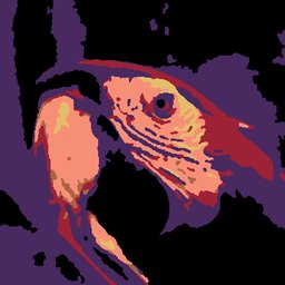 ThermalAn infrared heat map: brightness becomes temperature, mapped onto the warmest and coolest filaments you own.
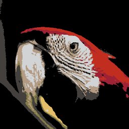 TintYour whole image washed toward a color you choose, so the print takes on that hue while staying in your owned filaments. Pick the hue on the color wheel. Intensity sets how strong the wash is, and even at its lowest it keeps a light wash rather than turning the style off.
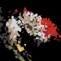 Van GoghSwirling brushstrokes that follow the image’s flow, Van Gogh style.
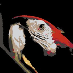 Vintage PosterHue true banded shading, the way a screen printed travel poster separates its colors.
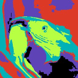 WarholFalse color screen print: the tones remapped onto a bold, deliberately unrealistic set of your filaments.
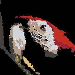 WatercolorSoft washes with wet edges, pooled where a brush would have left more pigment.
Color control
Filafy picks a palette for you, and then hands you five ways to argue with it. They all live in the Filament & colors tab on the Style & convert screen, or on the palette strip beside the preview.
- Swap. Click any swatch in Filaments in this preview and choose a different spool for that color. The rest of the palette stays where it is.
- Pin. Force one of your filaments into the print, whether or not Filafy would have chosen it.
- Exclude. Push a spool out of consideration for this conversion, without un owning it.
- Bind a filament to a color. Pin a filament and its row reads like an equation with a hole in it. The row is the spool, an arrow, and an empty slot saying Pick a color. That slot is the color this spool takes over. Click the slot and the rest of the page dims. Then click that color in the preview, or a swatch beside it. The slot fills in with what you picked.
- A binding, not just a pin. That pairing is a binding: it tells Filafy not just “use this spool” but “use it here”. That is what you want when a pin lands on the wrong part of the picture. A binding follows its pin, so removing the pin removes the binding.
- Base color. This is the filament that everything the artwork does not cover prints in. On a model that is the rest of the face, and on an art print it is the tile behind the picture. There is always one, so the field shows whichever color is currently doing the job and says where it came from. Chosen automatically means Filafy picked it, and clicking opens the picker. User selected means you did, and clicking puts it back to automatic. To change a color you picked, reset it and pick again.
Two dials: how many colors, and how closely they match
Max colors is your budget: the most filaments one print may use. It is the dial for the count. Move it when you want fewer spools to load, or more colors in the print. Color fidelity decides how closely Filafy matches your picture using that budget.
- Low. Merges near identical colors and stops adding filaments sooner. Use it when a simpler print matters more than an exact match. You load fewer spools, make fewer swaps at the printer, and spend no slot on two grays you would struggle to tell apart.
- Normal. The default, and right for almost everything. It adds a filament whenever the color that filament buys is worth a slot. It also respects the Priority you set on your spools, and Filafy's mild preference for keeping one finish family together.
- High. Chases the closest match it can. It looks at your image more finely, and weighs the whole picture evenly instead of favoring the middle. A small but distinct area can then still earn a spool. It also sets your spool priorities and finish preferences aside, so nothing but color accuracy decides the palette. Use it when getting a color exactly right matters more than which spools get used. Expect more swaps.
They interact, and it catches people out. Color fidelity can only choose within your Max colors budget. While the cap is low, every setting simply fills every slot and looks identical. Raise Max colors first if you want High to do anything visible.
When you are short a color
Missing a color? ranks the filaments that would improve this specific image most. It previews what adding each one would do, before and after. It is the fastest way to find out that one spool is the difference between an acceptable print and a good one. It also beats guessing as a shopping list.
Many pictures on one face
A face, or an art print, can carry up to 10 pictures at once, arranged however you like. A photo with a logo in the corner, a row of icons, a collage.
- Add them. On Set up, drop or pick several images at once: the first becomes the project’s main picture and the rest land on top of it. You can also add more at any time with Add an image at the foot of the Images tab.
- Arrange them. Click a picture on the preview to select it. Then drag to move it, drag a corner handle to resize, and use the knob above it to rotate. The gestures are the same as for a single image. The one in front wins the click, and the others are outlined so you can see where they are.
- Convert once. The whole face is converted together, so it costs one credit, not one per picture.
The Images tab
Every picture on the print has a row in the Images tab of the controls column, front one first. The row alone reorders (with the arrows, or by dragging it), duplicates and removes. It is also how you reach a picture that is completely hidden behind another. Opening a row selects that picture and shows what belongs to it alone: Opacity, Remove background with its sensitivity slider, and Flip. Selection works both ways, so clicking a picture on the preview opens its row.
Click a picture’s name to rename it, on this tab or on Set up: type the new name and press Enter, or click away. Press Escape, or empty the field, to keep the name it had. A name can be up to 60 characters and is saved with the project, so it is still there when you open the project again. A longer file name is shortened to 60 characters when you upload it. Naming a picture never renames the project.
What sharing a face means
- One style and one palette for all of them. Filafy picks the filaments for the finished face as a whole, so your Max colors budget is shared between every picture. Several busy photos at once will push it. If a picture looks flatter than it did on its own, that is the budget. Raise Max colors, or use fewer and simpler pictures. Filafy says so under the preview when it is actually costing you detail.
- Overlap covers unless you turn a picture down. At the default Opacity of 100% whichever picture is in front simply wins. Lower a picture's Opacity and it mixes with the one below it instead. The print's flat colors are then chosen from the blend. The other ways to let one picture show through another are transparency in the picture itself. Use a PNG with a transparent background, or Remove background on the selected picture.
- The bottom picture always prints fully. Opacity is how much of a picture shows over the one below it, and the bottom picture has none. Its row shows a note in place of the slider. Move a picture above another one and its slider comes back.
- Small pictures lose fine detail. Everything is sized for a real printed part. Shrinking a picture shrinks its features toward what your nozzle can actually lay down, and the smallest of them get cleaned away. If a shrunk logo goes mushy, make it bigger or give the print a bigger nozzle’s worth of room.
- Any format, any picture. iPhone HEIC photos and SVGs are converted in your browser first, wherever you add them.
Two things still belong to the first picture alone: it names the project, and on an art print its proportions size the tile. Original is the exception to all of this, because it prints your image’s own outline. It holds one picture only, and adding a second switches you to a shape that has a frame. Everything else is per picture, background removal included.
How close it gets
Filafy rebuilds your picture out of the filament colors you own, so some gap from the original is permanent. A photo holds millions of colors, and a print holds the handful of spools on your shelf. The useful question is how small that gap goes, and the answer is mostly in your hands.
On the photos we tested, a well stocked shelf lands most images in the same very close to close range. That is the range My Filaments uses when it rates a color match. A thin or badly matched shelf is what puts an image outside it. Here is what actually moves the result, strongest first.
- The spools you own. This one sets the ceiling, because every setting below it can only choose from what is already on your shelf. Adding just three well chosen filaments cut the gap by between a third and three quarters on every image we measured. Six spools plus the right three beat twelve picked at random. You do not have to guess which three. Missing a color? ranks the filaments that would help this specific image, and shows you a before and after.
- Max colors. It starts deliberately modest, so a first print does not need a full shelf. Raising it toward 16 was worth between two fifths and three quarters on our test images. Above 16 it stopped making a difference on every one of them. Filafy stops adding colors once another one would not earn its place. Past that, the cap is no longer what is holding the image back. Raising Max colors is also what makes Color fidelity do anything visible, since while the cap is low every setting simply fills all the slots.
- Print it bigger. This buys detail rather than color. The smallest feature a printer can lay down is about two extrusion lines wide, and that size is fixed in millimeters. So the bigger the print, the smaller that feature is relative to your picture. Going from 50 mm to 400 mm cut the fine detail lost to that floor by well over a third. Color accuracy barely moved, because what gets dropped is mostly small stuff whose color was close to its surroundings anyway.
- Use a finer nozzle. Same effect, same reason: a 0.2 mm nozzle halves that smallest feature against a 0.4 mm one. Worth it for detailed work like lettering, fur or foliage, and worth nothing at all on a soft image like a gradient sky. It prints considerably slower, so it is a trade rather than a free upgrade.
When your upload is the limit
All four assume the picture has the detail to give. If yours holds fewer pixels than the print can use, Set up, the Images tab and the Look tab all say so. Filafy enlarges it to fit rather than refusing.
Where it helps, that same note compares two spacings. The first is how far apart your image’s pixels land at the size you are printing. The second is how finely the print itself could place a color edge. You can then see whether the file or the settings is holding the edges back. Enlarging invents nothing, so a bigger original is the only thing that sharpens them.
Where the Color fidelity dial fits
The four above are what move the result most, and we measured them. Color fidelity is a smaller and different lever. It changes neither what is on your shelf nor how many slots you have, only how Filafy spends the slots it has.
Reach for Low when you would rather load fewer spools. Reach for High when an exact color match matters more than honoring your spool priorities and finish preferences. Both only do anything once Max colors is high enough to leave the setting room to choose. Color control, above on this page, describes each notch and when to use it.
One thing worth knowing about Simplify: at 0 it leaves your image exactly as the colors mapped. That includes specks too small for your printer to actually reproduce. It is on purpose, so nothing is thrown away without you asking. It does mean the preview can show finer detail than the finished object will carry. Nudging Simplify up applies the real printable floor, and is the honest preview of a detailed image.